Rethinking Popfeed’s Homepage UX

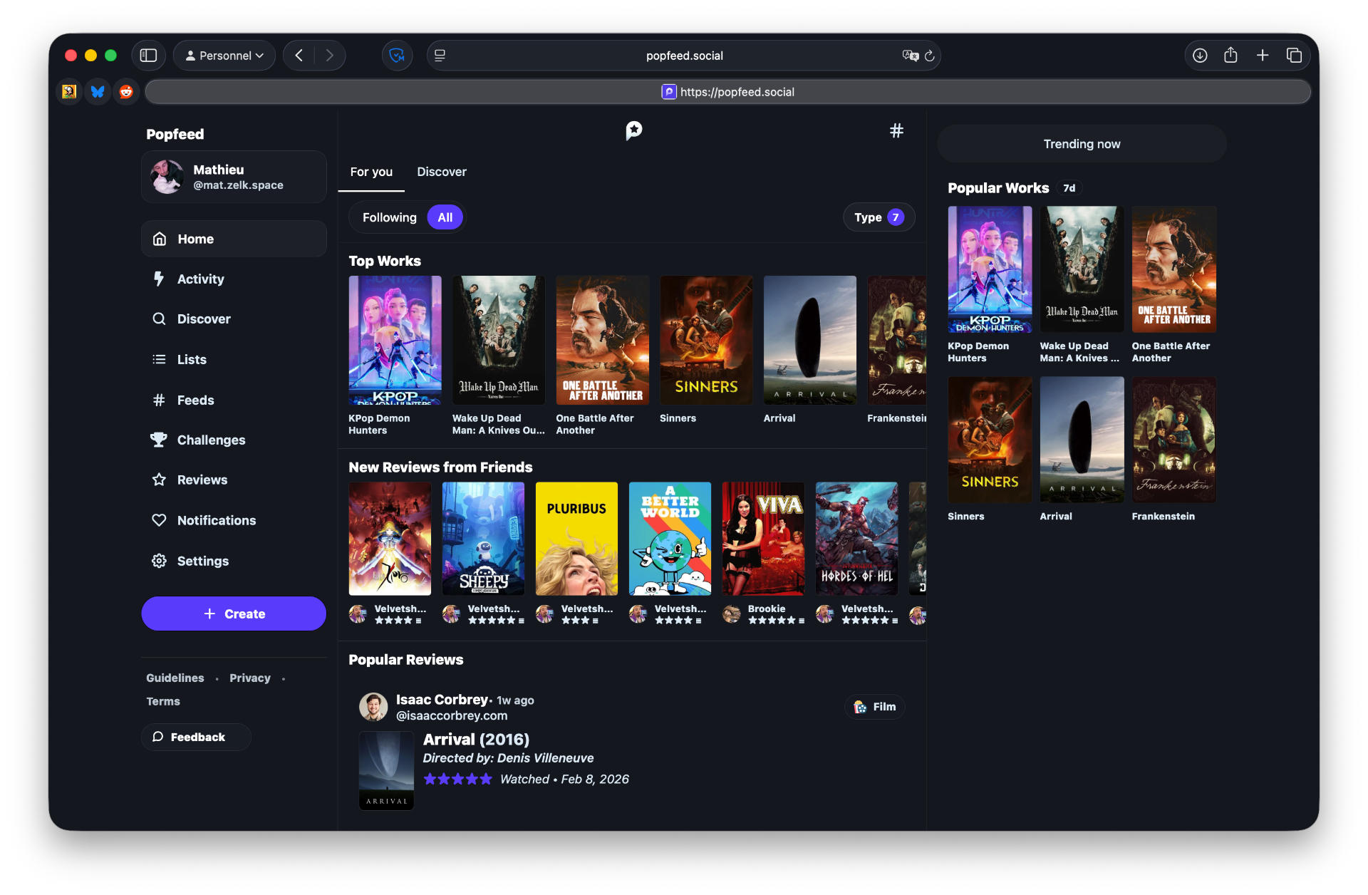
Popfeed.social is a new social application, similar to Letterboxd, that allows users to log movies, but also TV shows, music, and video games. Built on the ATProto, it offers a seamless transition for Bluesky users: you can log in and immediately retrieve your following, followers, and past reviews without having to rebuild your community from scratch.
Popfeed is a pioneer in the ATmosphere (the ecosystem of apps powered by ATProtocol), and it is clearly a promising tool. However, I believe the user experience could be significantly improved by distancing itself from the interface logic of Bluesky.
For this study, we will focus on the homepage UX, specifically regarding movies and TV shows (though these flows can be adapted to books, games, or music).

My Experience with Media Tracking Apps
As a long-time fan of Letterboxd, I find their interface peerless. It’s a masterclass in UX that makes it incredibly easy to see what your circle has recently watched. The design is clean and focused. It’s comfortable because you know exactly why you’re there, and the app never lets you get lost.
I also frequently use Trakt, which leans more toward being a library management tool for movies and series. Here, the social aspect is secondary. The user's primary goal is utility: checking off an episode or a movie to stay up-to-date with their personal progress.
Popfeed currently sits somewhere in between… and that’s where the friction begins.
The core issue
The main issue with Popfeed is that it's currently "sitting between two chairs." What is the user's primary goal? Writing a review? Seeing what friends are consuming? Tracking every single watch?
The interface shifts too much depending on the user's intent. Is it truly relevant to highlight "trending" films or a "Discover" tab (filled with strangers) if the user simply wants to see their friends' recent activity?
The homepage structure changes dramatically depending on the answer. Microblogging platforms like Bluesky or Twitter rely on infinite scroll to maximize content exposure. But is that really what someone wants when they open a tracking app? If I just finished an episode, do I want to scroll endlessly through reviews from strangers about films I don’t know?
Defining the core user goal
To understand how to improve Popfeed, we first need to look at the two distinct types of users it attracts:
The Letterboxd persona is primarily film centric. For them, the app is a digital trophy room where they track watched films and showcase their cinematic culture. They aren't just looking for a log. They want to engage with a niche community through long-form critiques or quick, witty reviews. Their primary motivation is social validation: seeing what friends are watching, and curating thematic lists to share. Consequently, they need a low-friction interface that allows for easy navigation through genres and years. Their main frustrations stem from impersonal recommendations and "analysis paralysis" when faced with a library that doesn't help them decide what to watch tonight.
On the other hand, the Trakt persona is driven by utility and organization across both movies and TV shows. Their goal is to centralize every piece of media they consume, with a particular focus on tracking episode-by-episode progress. They are motivated by the "all-in-one" overview of their habits and rely heavily on seamless synchronization between devices. Unlike the social-first user, they need reliability above all else. Their frustrations usually arise from dense, technical interfaces that feel dated or overly restrictive under freemium models.
Ultimately, these two profiles converge on a single truth: the user’s core purpose is to collect their media history as a personal archive and discuss it within their trusted circle.
Mapping the friction
While the steps for logging a movie are similar across platforms, the flow for logging a TV episode in Popfeed requires significantly more steps than in Trakt. This is a major friction point that needs to be addressed to retain "power users."
Reframing the homepage
Now that we have defined the personas and the main user flows, we can focus on the design opportunities and the features to prioritize on the homepage.

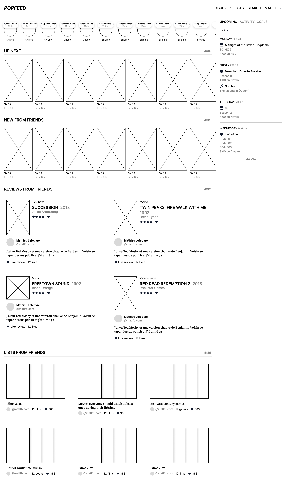
Wireframes - My proposal
One of the final step before moving to high-fidelity mockups: wireframes.
For this wireframe, I mainly built on the features identified earlier and reorganized the sections according to priority using a clear hierarchy from "most important" to "complementary”.
Navigation
I’ve stripped the navbar down to the essentials. The goal is to declutter the homepage and distribute secondary sections elsewhere. I’ve removed the "Feeds" section, as I question its relevance in a dedicated media tracking context.
Real-time
This section shows what friends are consuming in real-time. This data can be scrobbled via APIs:
In my opinion, real-time activity tracking is such a compelling feature that it should be made available across the most of ATProto apps. Having this "live pulse" integrated into the ATmosphere would create a much more connected and human ecosystem.
Up Next
The feature I miss most on Popfeed is one-click tracking. I’ve integrated an "Up Next" section where users can hquick glance at the latest logs (movies, albums, games). By hovering over a card, a user can mark an episode as watched instantly, without ever leaving the homepage.
New from friends
A quick glance at the latest logs (whether it’s movies, shows, albums or games).
Reviews from friends
The Reviews from Friends section highlights popular reviews or posts your friends have interacted with (movies, shows, albums or games).
Lists from friends
This section is meant to be a "warmer," more social alternative to algorithmic feeds. I chose to prioritize curated lists from friends to make the experience feel more human.
Side Pannel: Upcoming, Activity, Goals
Upcoming allows the user to see upcoming releases at a glance. They can either view all media or filter them by type using the dropdown menu.
Activity groups our activities as well as those of our friends. This feature is mainly inherited from Letterboxd and avoids the very conventional look of a "Notifications" section.
To conclude, Goals is the section that allows users to consult their objectives, as well as those of their friends. We can see which media is involved and the current goal.

Thank you for reading me! If you like my work, you can find more at matlfb.com, follow me on Bluesky/Mastodon or send me an email at [email protected]. I’m a freelance designer and I’m currently accepting new clients. I would be thrilled to help bring your projects to life! 🌈
Log in to leave a note.